Some effects for Gallery Grid on Squarespace 7.1
- Add code into Home > Design > Custom CSS.
- You can also use these effects for any Galleries: Grid, Masonry, Strips, Reel, just change “grid” text to “masonry”, “reel”, “strips”.
Gallery 01. Show title/overlay on hover
figure.gallery-grid-item {
    position: relative;
}
.gallery-caption {
    position: static;
}
/* title */
figcaption.gallery-caption .gallery-caption-wrapper p.gallery-caption-content {
    position: absolute;
    left: 0;
    top: 0;
    right: 0;
    bottom: 0;
    display: flex;
    justify-content: center;
    align-items: center;
    z-index: 999;
    padding: 7%;
    transition: opacity ease 200ms !important;
    opacity: 0 !important;
pointer-events: none;
}
.gallery-grid-item:hover .gallery-caption-wrapper p.gallery-caption-content {
    opacity: 1 !important;
}
/* overlay */
.gallery-grid-item-wrapper a:after {
    background: #f4f6ea; /* overlay color */
    content: "";
    display: block;
    position: absolute;
    top: 0;
    left: 0;
    right: 0;
    bottom: 0;
    opacity: 0;
    transition: opacity ease 200ms !important;
}
.gallery-grid-item:hover .gallery-grid-item-wrapper a:after {
    opacity: 0.75;
}
/* remove gap */
figcaption {
    padding: 0 !important;
}
Gallery 02. Show image full color on hover
.gallery-grid-item img {
    filter: grayscale(1);
    -webkit-filter: grayscale(1);
}
.gallery-grid-item:hover img {
    filter: grayscale(0);
    -webkit-filter: grayscale(0);
}
Gallery 03. Change Image on Hover
Notes
- From left to right
- Image 01: nth-child(1)
- Image 02: nth-child(2)
- Image 03: nth-child(3)
- …
/* hide image on hover */
  figure.gallery-grid-item:hover img {
    visibility: hidden;
}
  /* change image on hover */
  figure.gallery-grid-item:hover a {
    background-size: cover;
    background-repeat: no-repeat;
}
  /* image 01 */
  figure.gallery-grid-item:nth-child(1) a {
        background-image: url(https://cdn.pixabay.com/photo/2018/09/24/03/05/cat-3699032__340.jpg);
  }
   /* image 02 */
  figure.gallery-grid-item:nth-child(2) a {
        background-image: url(https://cdn.pixabay.com/photo/2020/08/11/13/28/flowers-5479950__340.jpg);
  }
   /* image 03 */
  figure.gallery-grid-item:nth-child(3) a {
        background-image: url(https://cdn.pixabay.com/photo/2020/07/09/10/20/bird-5386773__340.jpg);
  }
   /* image 04 */
  figure.gallery-grid-item:nth-child(4) a {
        background-image: url(https://cdn.pixabay.com/photo/2020/08/10/20/43/waterfall-5478761__340.jpg);
  }
   /* image 05 */
  figure.gallery-grid-item:nth-child(5) a {
        background-image: url(https://cdn.pixabay.com/photo/2019/10/21/14/54/oranges-4566275__340.jpg);
  }
     /* image 06 */
  figure.gallery-grid-item:nth-child(6) a {
        background-image: url(https://cdn.pixabay.com/photo/2020/07/15/07/15/flower-5406664__340.jpg);
  }
Gallery 04. Subtitle
Personal Plan
Edit Description, use this format: Title <span>sub title</span>
Next, add this into Design > Custom CSS
p.gallery-caption-content span {
  display:block;
  font-size: 12px;
  color: red;
  }
Update soon
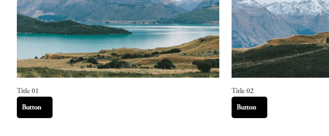
Gallery 04. Title/Button
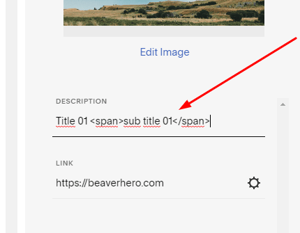
Edit Image Description > Use this format
Title 01 <a href="https://beaverhero.com">Button</a>
Next, add to Home > Design > Custom CSS
p.gallery-caption-content a {
    display: block;
    background: black;
    color: white;
    width: 50px;
    padding: 10px;
    border-radius: 5px;
}
You will have
To make title/button over image, add this code
figure.gallery-grid-item {
    position: relative;
}
.gallery-caption {
    position: static;
}
p.gallery-caption-content {
    position: absolute;
    left: 0;
    top: 0;
    right: 0;
    bottom: 0;
    display: flex;
    justify-content: center;
    align-items: center;
    z-index: 999;
    padding: 7%;
    transition: opacity ease 200ms !important;
    pointer-events: none;
}
p.gallery-caption-content a {
    position: absolute;
    top: 55%;
}