Use this tool to find block ID.
Image Box 1. Show text on hover
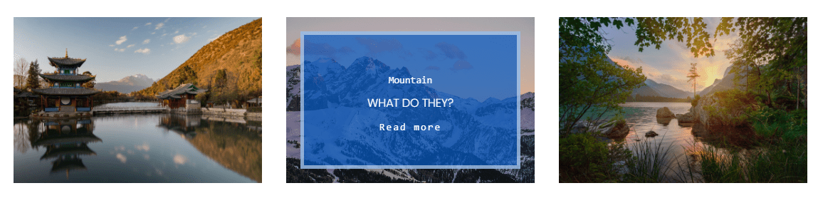
1. Add 3 Poster Blocks
and enter title, subtitle, button
2. Add Code Block
& insert below code
<style>
  /* image */
  .image-block:hover img {
    transform: scale(1.1);
}
  .image-block img {
    transition: all 0.5s ease;
}
/* set background */
.image-block figcaption.image-card-wrapper {
    background: rgba(4,90,196,.7);
    transition: all .5s ease !important;
    max-height: 100%;
    box-sizing: border-box;
    margin: 20px;
    border: 5px solid rgba(255,255,255,.5);
  	opacity: 0;
}
.image-block figcaption.image-card-wrapper * {
    text-align: center;
  	color: #fff !important;
}
/* show on hover */
.image-block:hover figcaption.image-card-wrapper {
    opacity: 1;
    visibility: visible;
}
/* button */
.image-block .image-button-inner a {
    font-family: monospace;
    font-size: 14px;
    letter-spacing: 2px;
    transition: all .3s ease-out;
    background: transparent !important;
    padding: 0;
}
/* title */
.image-block .image-title-wrapper p {
    font-size: 14px;
    font-family: monospace;
}
/* sub title */
.image-block .image-subtitle-wrapper p {
    text-transform: uppercase;
}
/* title sub button spacing */
.image-block figcaption.image-card-wrapper * {
    margin-top: 5px !Important;
}
</style>
Image Box 2. Simple box shadow
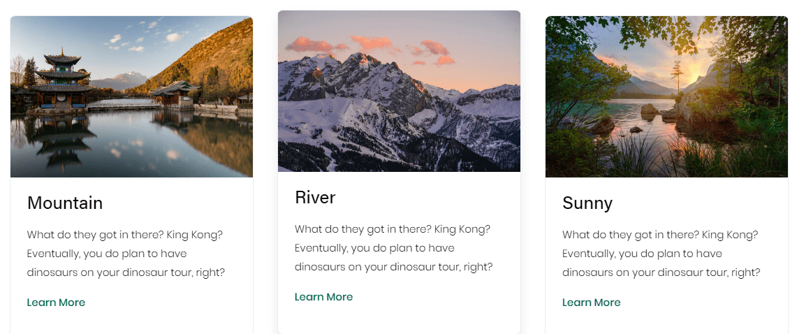
1. Add 3 Image Blocks
and enter title, description, text link
2. Add Code Block
<style>
/* set border background */
.image-block .sqs-block-content {
    border: 1px solid #eaedf2;
    background: #fff;
    border-radius: 8px;
    transition: all .2s ease-in-out;
}
/* scale shadow on hover */
.image-block:hover .sqs-block-content {
    transform: translateY(-.5rem);
    box-shadow: 0 0.5rem 1rem rgba(0,0,0,.09);
}
/* image */
.image-block .sqs-block-content img {
    border-top-left-radius: 8px;
    border-top-right-radius: 8px;
}
/* text */
.image-block .image-caption-wrapper {
    padding: 1.5em;
}
/* heading */
.image-block .image-caption-wrapper h4 {
    margin-top: 0;
    margin-bottom: 0;
}
/* paragraph */
.image-block .image-caption-wrapper p {
    font-size: 15px;
}
/* link */
.image-block p a {
    color: #00684c;
  	font-weight: 500;
  	background-image: none;
}
</style>
Image Box 03. Text show on Hover, Title stay

1. Add 3 Image Blocks
- Design: Inline
- Caption Below
- Enter URL in Clickthough URL
and add Image, Text
- Title: Heading 4
- Description: Quote
2. Add Code Block with below code
<style>
  /* Description */
figcaption.image-caption-wrapper blockquote {
    position: absolute;
    top: calc(50% - 40px);
    left: 50%;
    width: 90%;
    transform: translate(-50%,-50%);
    color: #fff;
    opacity: 0;
    font-size: 14px;
    pointer-events: none;
    z-index: 999;
}
  body:not(.sqs-edit-mode) blockquote {
    margin-left: 0;
    text-align: center;
}
  .sqs-block-image-link:hover + figcaption blockquote {
    opacity: 1;
}
  /* image hover effect */
  .image-block-wrapper:after {
    content: "";
    display: block;
    position: absolute;
    top: 0;
    left: 0;
    right: 0;
    bottom: 0;
    background: rgba(0,0,0,0.5);
    z-index: 997;
    opacity: 0;
    transition: all 0.25s ease-in-out;
}
.sqs-block-image-link:hover .image-block-wrapper:after {
    opacity: 1;
}

  /* space between image-heading-text */
  .image-block h4 {
  	margin-top: 1px;
    margin-bottom: 1px;
  }
</style>
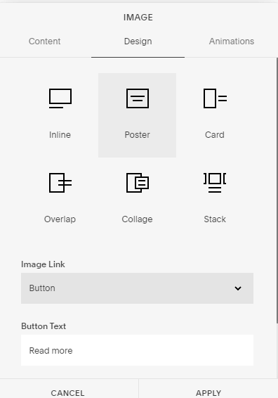
Image Box 04. Image show on Hover
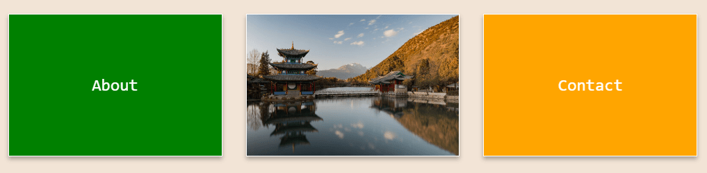
1. Add 3 Image Blocks
- Design: Poster
- Image Link: On Image
- Enter link in Clickthough URL
then Enter Text in Title
2. Add Code Block
with this code
<style>
  /* Box color */
  .col:nth-child(1) figcaption {
    background: green;
}
  .col:nth-child(2) figcaption {
    background: rebeccapurple;
}
  .col:nth-child(3) figcaption {
    background: orange;
}
  /* center text */
  .col figcaption * {
    text-align: center;
    font-family: monospace;
}
  /* hover */
  .image-block:hover figcaption {
    opacity: 0;
}
  .image-block figcaption {
    transition: opacity 0.25s ease-in;
}
  /* Box shadow */
  .image-block figure {
    box-shadow: 0 4px 4px 0 rgba(0,0,0,0), 0 4px 6px 0 rgba(0,0,0,.3);
    border: 1px solid white;
}
</style>
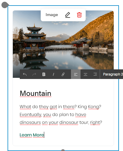
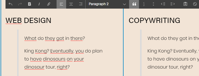
Image Box 05. Float Number
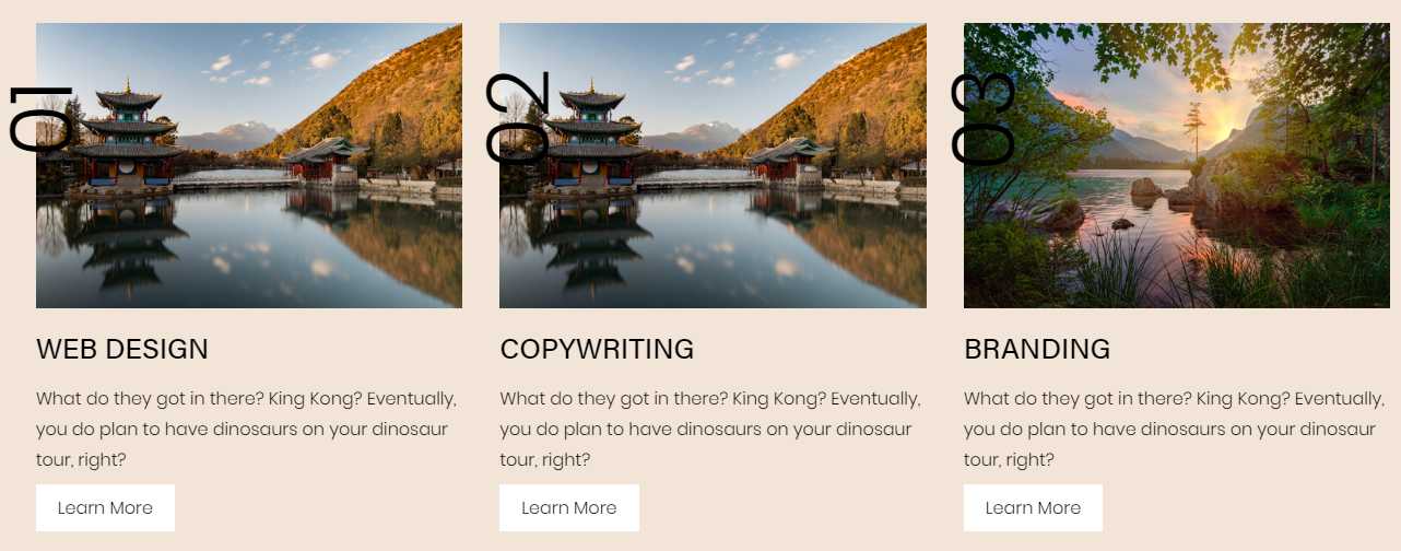
1. Add 3 Image Blocks
- Design: Inline
- Caption Below
- Enter link in Clickthrough
then enter text
- Title: Heading 4
- Description: Paragraph 2
- Learn More: Text Link, Paragraph 2
- Number: Quote
2. Add Code Block
<style>
  /* 01 02 03 */
.image-block figcaption blockquote {
    position: absolute;
    top: 0;
    left: -30px;
    padding-left: 0;
    margin-left: 0;
    margin-top: 0;
    padding-top: 0;
    font-size: 5em;
    transform: rotate(-90deg);
}
  /* Learn more link */
.image-block a {
    background: white;
    padding: 10px 20px;
}
  /* space between image-heading-text */
  .image-block h4 {
  	margin-top: 1px;
    margin-bottom: 1px;
  }
</style>
Image Box 06. Box Shadow, Divider, Button Hover
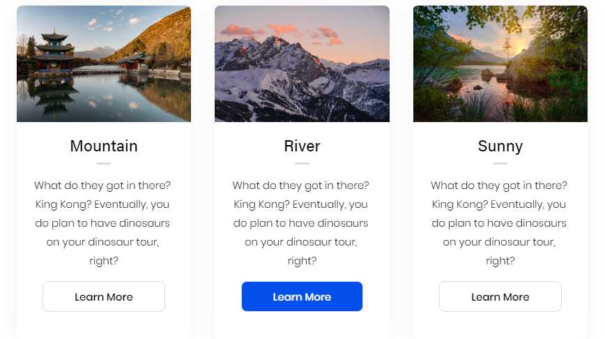
1. Add 3 Image Blocks
- Design: Inline
- Caption below
- Enter url in Clickthrough URL
- Title: Heading 4
- Description: Paragraph 2
- Button: Text Link
2. Add Code Block
<style>
/* 3 boxes shadow */
.image-block .sqs-block-content {
    background: #fff;
    border-radius: 8px;
    box-shadow: 0px 0px 35px 0px rgba(0,0,0,0.05);
}
/* image */
.image-block .sqs-block-content img {
    border-top-left-radius: 8px;
    border-top-right-radius: 8px;
}
/* all text */
.image-block .image-caption-wrapper {
    padding: 1.5em;
}
/* heading */
.image-block .image-caption-wrapper h4 {
    margin-top: 0;
    margin-bottom: 0;
}
  /* Line */
  .image-block h4:after {
    content: "";
    background: #dadce2;
    display: block;
    height: 3px;
    width: 10%;
    margin: 0 auto;
    margin-top: 10px;
}
/* paragraph */
.image-block .image-caption-wrapper p {
    font-size: 15px;
}
/* Button */
.image-block p a {
    font-weight: 500;
    background-image: none;
    border: 1px solid #dadce2;
    display: inline-block;
    padding: 0.5em 3em;
    border-radius: 8px;
  	transition: all 0.3s ease;
}
  /* Button hover */
  .image-block p a:hover {
    background: #0150ec;
    color: white;
}
</style>
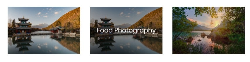
Image Box 07. Scale title on hover
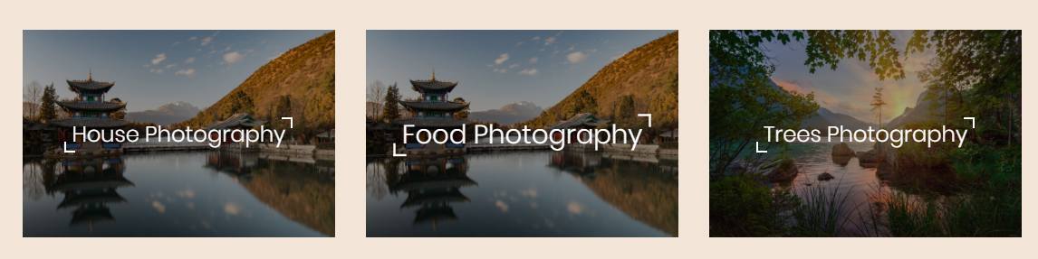
1. Add Image Blocks
- Design: Poster
- Image Link: On Image
- then enter text
2. Add Code Block
<style>
/* Image overlay */
.image-block .image-inset:after {
    content: "";
    display: block;
    position: absolute;
    background: rgba(0, 0, 0, 0.3);
    top: 0;
    bottom: 0;
    left: 0;
    right: 0;
    z-index: 900;
}
/* fullwidth text */
  figcaption.image-card-wrapper {
    z-index: 999 !important;
}
.image-card {
    width: 100% !important;
  	padding-left: 5px;
  	padding-right: 5px;
}
  .image-title {
    text-align: center;
    transition: all 0.5s;
}
  /* text scale effect */
.image-title p {
    position: relative;
    transition: 0.4s;
}
.image-title p:before {
    content: "";
    height: 10px;
    width: 10px;
    border-bottom: 2px solid #FFFFFF;
    border-left: 2px solid #FFFFFF;
    position: absolute;
    left: -8px;
    bottom: -4px;
}
.image-title p:after {
    content: "";
    height: 10px;
    width: 10px;
    border-top: 2px solid #FFFFFF;
    border-right: 2px solid #FFFFFF;
    position: absolute;
    right: -8px;
    top: -2px;
}
.image-block figure:hover .image-title {
    transform: scale(1.2);
}
</style>
Image Box 08. Show Link on Hover
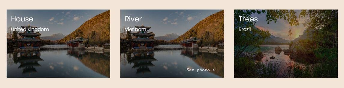
1. Add Image Blocks
- Design: Poster
- Image Link: Button
- Button Text: type “See photo >”
then fill in title, sub title
2. Add Code Block
<style>
/* Image overlay */
.image-block .image-inset:after {
    content: "";
    display: block;
    position: absolute;
    background: rgba(0, 0, 0, 0.3);
    top: 0;
    bottom: 0;
    left: 0;
    right: 0;
    z-index: 999;
}
figcaption.image-card-wrapper {
    align-items: flex-start !important;
    z-index: 10000 !important;
}
/* align text top left */
.image-card {
    width: 100% !important;
    padding-left: 15px;
    padding-top: 10px;
}
figcaption.image-card-wrapper {
    align-items: flex-start !important;
}
.image-subtitle {
    margin-top: 0 !important;
}

/* link */
body:not(.sqs-edit-mode) .image-button-inner a {
    background: transparent !important;
    font-weight: 400;
    font-size: 15px;
    font-family: monospace;
    position: absolute;
    bottom: 0;
    right: 0;
    color: rgba(255,255,255,0.75) !important;
    transition: all 0.5s !important;
    opacity: 0 !important;
}
.image-block:hover .image-button-inner a {
    opacity: 1 !important;
}
</style>
Image Box 09. Show button on hover
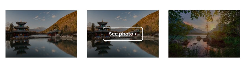
1. Add Image Blocks
- Design: Poster
- Image Link: Button
2. Add Code Block
<style>
/* Image overlay */
.image-block .image-inset:after {
    content: "";
    display: block;
    position: absolute;
    background: rgba(0, 0, 0, 0.3);
    top: 0;
    bottom: 0;
    left: 0;
    right: 0;
    z-index: 999;
}
/* button style */
.image-button-inner a {
    transition: all 0.5s !important;
    opacity: 0 !important;
    background: transparent !important;
    border: 2px solid #fff;
    border-radius: 8px;
    padding: 10px 20px;
}
  /* show button on hover */
.image-block:hover .image-button-inner a {
    opacity: 1 !important;
}
  /* misc */
  figcaption.image-card-wrapper {
    z-index: 999 !important;
}
.image-card {
    width: 100% !important;
}
.image-button {
    margin-top: 0 !important;
}
.image-button-inner {
    text-align: center;
}
</style>
Image Box 11.
1. Add 3 Image Blocks
- Design: Poster
- Image Link: On Image
- Text: Paragraph 1
2. Add Code Block
<style>
/* Image overlay */
.image-block .image-inset:after {
    content: "";
    display: block;
    position: absolute;
    background: rgba(0, 0, 0, 0.3);
    top: 0;
    bottom: 0;
    left: 0;
    right: 0;
    z-index: 900;
  	opacity: 0;
    transition: all 0.5s;
}
  .image-block:hover .image-inset:after {
  	opacity: 1;
  }
/* fullwidth text */
  figcaption.image-card-wrapper {
    z-index: 999 !important;
}
.image-card {
    width: 100% !important;
  	padding-left: 5px;
  	padding-right: 5px;
}
 body:not(.sqs-edit-mode) .image-title {
    text-align: center;
    transition: all 0.5s;
    opacity: 0;
}
  /* text scale effect */
.image-title p {
    position: relative;
    transition: 0.4s;
}
.image-block figure:hover .image-title {
    opacity: 1;
}
</style>
Image Box 12

1. Add 3 Markdown Blocks
- Design: Inline
- Caption Below
- Title: Heading 4
- Description: Paragraph 2
2. Add Code Block
<style>
/* set background round border */
.image-block .sqs-block-content {
    padding: 10px;
    transition: all .2s ease-in-out;
}
  /* hide text */
  .image-block figcaption {
  	opacity: 0;
    transition: all .2s ease-in-out;
  }
/* box on hover*/
.image-block:hover .sqs-block-content {
    background: #f1f5f9;
    border-radius: 8px;
}
  /* show text on hover */
  .image-block:hover figcaption {
  	opacity: 1;
  }
/* image round corner */
.image-block:hover .sqs-block-content img {
    border-top-left-radius: 8px;
    border-top-right-radius: 8px;
}
  /* space between text - image */
  figcaption.image-caption-wrapper {
    padding-top: 10px !important;
}
/* heading */
.image-block .image-caption-wrapper h4 {
    margin-top: 0;
    margin-bottom: 0;
}
/* description padding */
  .image-caption p {
    margin-top: 5px;
    margin-bottom: 5px;
}
</style>
Super useful, thanks for this! Is there anyway to get something similar working for Gallery Block images in 7.1? The layout and spacing of that style feels a lot more appealing than stacking Posters next to each other. Tried reworking the CSS to apply to .gallery-grid-item, but no luck (very new at all this).
Updated 3 Image Boxes.
Which effect do you want to copy to Gallery Block Images? & Which Gallery images style do you use? (Grid simple, Grid Strips, Reel,…)?
All is possible (I think). You can send t a request via the form: https://beaverhero.com/covid19/
I will check.
If it can be done quickly, I will write a guide for the Gallery in the next few days.
Thanks so much. Works well.