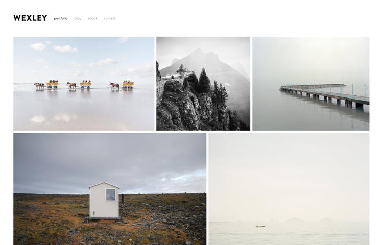
Wexley: A mosaic gallery that adapts to the size of your images makes this an optimal website template for photographers and creative professionals.

In this post
Notes
- Adding Custom CSS to Home > Design > Custom CSS
- Adding !important to after, if CSS doesn’t work! for example: font-size: 20px !important;
- With One page. Add to Page Settings > Advanced > Header (If you use Personal Plan > Edit Page > Add Code Block > Add code)
- Send me a message if you have any questions/the code doesn’t work (free).
- You can send a donation if this is helpful for you 😉
Header
Hide Site Title
Entire Site
.logo {
    display: none !important;
}
One Page
<style>
.logo {
    display: none !important;
}
</style>
Hide Navigation
Entire Site
/* Desktop - Tablet */
div#topNav {
    display: none;
}
/* Mobile */
div#mobileMenuLink {
    display: none;
}
One Page
<style>
/* Desktop - Tablet */
div#topNav {
    display: none;
}
/* Mobile */
body#collection-56d86c682b8dde72910d59bd div#mobileMenuLink {
    display: none;
}
</style>
Full-width Header Background Color
div#headerWrapper {
    position: absolute !important;
    top: 0;
    left: 0;
    right: 0;
    padding-top: 60px;
    padding-left: 60px;
    padding-right: 60px;
    background: green;
}

div#pageWrapper {
    margin-top: 115px;
}
Hide Header
Entire Site
/* Desktop - Tablet */
header#header {
    display: none;
}
/* Mobile */
div#mobileMenuLink {
    display: none;
}
One Page
<style>
/* Desktop - Tablet */
header#header {
    display: none;
}
/* Mobile */
div#mobileMenuLink {
    display: none;
}
</style>
Underline Navigation Active Link
#topNav li.active-link a {
    text-decoration: underline;
}
Align Right Navigation
div#topNav {
    float: right !important;
}
Change “Menu” word on Mobile
#mobileMenuLink a {
    visibility: hidden;
}
#mobileMenuLink a:after {
    visibility: visible;
    content: "New Menu";
    display: block;
    text-align: center;
    font-size: 20px;
    margin-top: -20px;
}
Change Menu Color (Mobile)
div#mobileMenuLink {
    background: #ff0000;
    padding-top: 10px;
}
div#mobileMenuLink a {
    color: #fff;
    font-size: 20px !important;
}
Disable Click on Navigation Active Link
#topNav .active-link a {
    pointer-events: none;
}
Footer
Remove Footer
Entire Site
div#footerWrapper {
    display: none;
}
One Page
<style>
div#footerWrapper {
    display: none;
}
</style>
Blog – Blog Posts
Remove Post Date
/* Blog List Page */
.view-list.collection-type-blog .published {
    display: none;
}
/* Blog Post Page */
.view-item.collection-type-blog time.published {
    display: none;
}
Remove Post Category
.meta .categories {
    display: none;
}
Remove Post Tag
.meta .tags {
    display: none;
}
Increase Post Content Width
Blog List Page
.view-list.collection-type-blog section#page {
    max-width: 100%;
}
Blog Post Page
.view-item.collection-type-blog section#page {
    max-width: 100%;
}
Portfolio
Change prev/next
/* prev */
span.control.prev-slide {
    visibility: hidden;
}
span.control.prev-slide:after {
    visibility: visible;
    content: "New Prev";
    font-size: 15px;
    color: #ff0000;
}
/* Next */
span.control.next-slide {
    visibility: hidden;
}
span.control.next-slide:before {
    visibility: visible;
    content: "New Next";
    font-size: 17px;
    color: #ff0000;
}
Page
One Page background color
<style>
div#canvasWrapper {
    background: red;
}
</style>
Featured Image: Squarespace.com
Can you change the background color of a single page in Wexley template (7.0)? I want to have several webpages with a different background color to separate it visually from the rest of the site.
Just updated the code. You can check again!
Hey Tuan,
thanks for sharing all this information, much appreciated!
I am completely lost if it comes to coding, so please excuse my dumb question:
Is it possible to change the position of the mobile menu in Wexley, so that it is positioned on the right – next to the logo?
I tried to find resources about this topic, but had no success.
I would be glad about any hint!
Best greetings from Germany,
Marcus
PS: Here’s the link to my website:
http://www.bilderschmied.com
Add to Design > Custom CSS
@media screen and (max-width:800px) {div#mobileMenuLink {
position: absolute;
right: 0;
top: 100px;
}}
Thank you so much for your quick answer, dear Tuan!
I gave your code just a quick try, because I don’t have much time right now.
The result wasn’t exactly what I was looking for, but you brought me a step closer …
Thanks again!