Squarespace released an Accordion Block a few weeks ago.
Here are some useful tips/code when you use the accordion block
Change Dividers Color
/* accordion divider color */
.accordion-divider {
    color: #ff00ff !important;
}
Change Arrows Color
/* accordion arrows color */
.accordion-block .arrow {
    border-color: #ffff00 !important;
}
Add icons before Accordion Titles
this example code for 3 accordion titles [nth-child(1), nth-child(2), nth-child(3)]
/* Accordion icons before titles */
li.accordion-item .accordion-item__title:before {
    content: "";
    width: 20px;
    height: 20px;
    display: inline-block;
    background-repeat: no-repeat;
    background-size: contain;
    background-position: bottom center;
}
li.accordion-item:nth-child(1) .accordion-item__title:before {
    background-image: url(https://cdn.pixabay.com/photo/2021/11/02/15/30/tealights-6763542__340.jpg);
}
li.accordion-item:nth-child(2) .accordion-item__title:before {
    background-image: url(https://cdn.pixabay.com/photo/2019/10/23/06/30/hamburg-4570577__340.jpg);
}
li.accordion-item:nth-child(3) .accordion-item__title:before {
    background-image: url(https://cdn.pixabay.com/photo/2021/02/17/08/02/woman-6023442__340.jpg);
}
Accordion Inside Accordion
You can use Accordion Tabs Plugin + Accordion Block to achieve this.
Different Color for Accordion Titles
/* accordion title colors */
li.accordion-item:nth-child(1) .accordion-item__title {
    color: red;
}
li.accordion-item:nth-child(2) .accordion-item__title {
    color: blue;
}
li.accordion-item:nth-child(3) .accordion-item__title {
    color: violet;
}
Change a specific word color in Accordion Content
To make specific word different color, first make it bold then use this CSS
/* accordion content specific word color */
.accordion-item__description strong {
    font-weight: normal;
    color: red;
}
Accordion Title Background Color
/* accordion title background */
.sqs-block-accordion .accordion-item__title-wrapper {
    background-color: #32a4e6;
}
Accordion Content Background
/* accordion content background */
.sqs-block-accordion .accordion-item__dropdown--open {
    background-color: #262853;
    color: white;
}
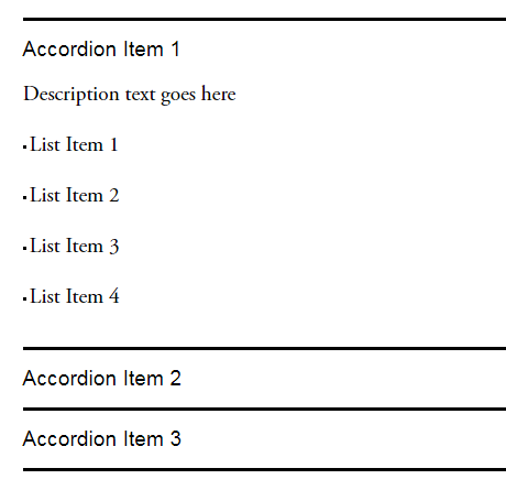
Add Unordered List in Accordion Content
First, add some text then Underline them
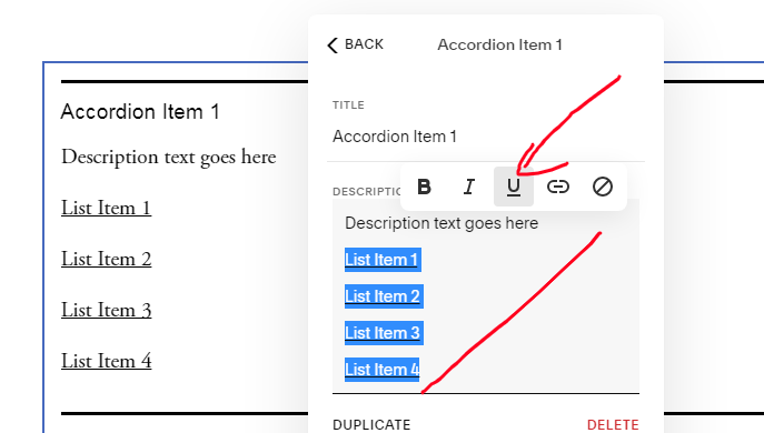
Next, use this CSS
/* Accordion Content - Add Unordered list */
span[style*="text-decoration"]:before {
    content: "";
    display: inline-block;
    width: 3px;
    height: 3px;
    background-color: black;
    vertical-align: middle;
    margin-right: 3px;
}
span[style*="text-decoration"] {
    text-decoration: none !important;
}
Result
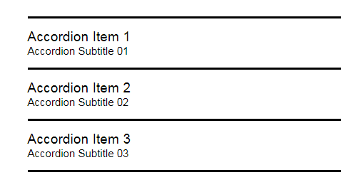
Accordion Titles – Add Line Break
/* Accordion SubTitle */
li:nth-child(1) span.accordion-item__title:after {
    content: "Accordion Subtitle 01";
    display: block;
    font-size: 15px;
}
li:nth-child(2) span.accordion-item__title:after {
    content: "Accordion Subtitle 02";
    display: block;
    font-size: 15px;
}
li:nth-child(3) span.accordion-item__title:after {
    content: "Accordion Subtitle 03";
    display: block;
    font-size: 15px;
}
Accordion Title-Content Text Size on Mobile only
/* accordion title - content text size on mobile */
@media screen and (max-width:767px) {
/* accordion title */
span.accordion-item__title {
    font-size: 12px !important;
}
/* accordion content */
.accordion-item__description * {
    font-size: 10px !important;
}
}
Accordion Content Links Style
/* Links underline */
div.accordion-item__description p a {
    border-bottom: 1px solid black;
}
/* Links font style */
div.accordion-item__description p a {
    color: red !important;
    font-size: 30px;
    font-family: monospace;
    letter-spacing: 2px;
}
Add a button inside Accordion Content
/* turn accordion link to button */
div.accordion-item__description p a {
    background-color: black;
    color: white !important;
    padding-left: 10px;
    padding-right: 10px;
    padding-top: 15px;
    padding-bottom: 15px;
    border-color: red;
    border-width: 1px;
    border-style: solid;
}
Add an image into Accordion Content
:before: image on top
:after: image on bottom
/* Add an image into Accordion Content */
/* replace demo image with your image url */
/* nth-child(1) is first accordion item, nth-child(2) is second item... */
li:nth-child(1) .accordion-item__description:before {
    content: "";
    display: block;
    width: 100%; /* image width, you can also use px */
    height: 150px; /* image height */
    background-image: url(https://cdn.pixabay.com/photo/2021/09/15/15/48/seals-6627197__340.jpg);
    background-repeat: no-repeat;
    background-size: cover;
    margin-bottom: 20px; /* space between image-text */
}
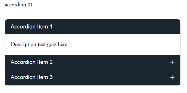
Accordion Style 01
Add a Code Block under Accordion >> Paste the code
<style>
/* accordion title color */
.accordion-item__title-wrapper {
    background-color: #1a252f;
    color: white;
    padding-left: 20px !important;
    padding-right: 20px !important;
}
.accordion-item__click-target {
    padding-top: 15px !important;
    padding-bottom: 15px !important;
}
/* make first item round corner */
li.accordion-item:first-child .accordion-item__title-wrapper {
    border-top-left-radius: 10px;
    border-top-right-radius: 10px;
}
/* make last item round corner */
li.accordion-item:last-child:not[data-is-open="true"] .accordion-item__title-wrapper {
    border-bottom-right-radius: 10px;
    border-bottom-left-radius: 10px;
}
/* remove divider between accordion items */
.accordion-divider {
    display: none;
}
/* accordion content padding */
.accordion-item__description {
    max-width: unset !important;
    padding: 20px !important;
}
/* arrows color */
.plus>div {
    color: white !important;
}
</style>