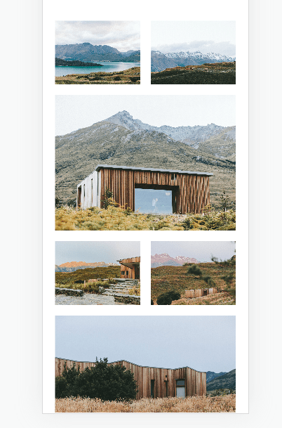
In this post
How to
#1. First you need to set Grid – Simple (or Grid – Overlay) to 2 columns
#2. Next, use this code to Custom CSS box
a.grid-item:nth-child(3n+3) {
    grid-column: ~"1 / 3" !important;
}
div#gridThumbs {
    grid-template-columns: repeat(2,minmax(0,1fr));
}
Extra
Apply code for specific portfolio page
With Business Plan/Higher, use this code to Page Header
<style>
a.grid-item:nth-child(3n+3) {
    grid-column: 1 / 3 !important;
}
div#gridThumbs {
    grid-template-columns: repeat(2,minmax(0,1fr));
}
</style>
With Personal/Basic Plan, use this code to Custom CSS
#enter-page-id {
a.grid-item:nth-child(3n+3) {
    grid-column: 1 / 3 !important;
}
div#gridThumbs {
    grid-template-columns: repeat(2,minmax(0,1fr));
}
}
Apply code for Desktop Only
For All pages, use this code to Custom CSS
@media screen and (min-width:768px) {
a.grid-item:nth-child(3n+3) {
    grid-column: ~"1 / 3" !important;
}
}
For specific portfolio page, use this code to Page Header
<style>
@media screen and (min-width:768px) {
a.grid-item:nth-child(3n+3) {
    grid-column: 1 / 3 !important;
}
}
</style>
For specific portfolio page (Personal Plan), use this code to Custom CSS
@media screen and (min-width:768px) {
#enter-page-id a.grid-item:nth-child(3n+3) {
    grid-column: ~"1 / 3" !important;
}
}
Need a help?
Just send me an email with your site url. I will answer within 24 hours