Some tricks with Header Navigation on Squarespace 7.1
In this post
Hide Navigation on One Page
To hide navigation bar on One Page, add to Page Settings > Advanced > Header
<style>
.header-nav {
    display: none;
}
.burger-box {
    visibility: hidden;
}
</style>
Hide Navigation Bar (Entire Site)
Add to Home > Design > Custom CSS
.header-nav {
    display: none;
}
.burger-box {
    visibility: hidden;
}
Hide page from Navigation
Add to Home > Design > Custom CSS
with /contact is Page URL Slug
.header-nav [href="/contact"] {
    display: none;
}
.header-menu-nav [href="/contact"] {
    display: none;
}
Add button to navigation bar
You can use this code to turn any link on navigation to button.
Add to Home > Design > Custom CSS
with /about is Page URL Slug
.header-nav-item [href="/about"], .header-menu-nav-item [href="about"] {
    background: black;
    color: white;
    padding-top: 5px !important;
    padding-bottom: 5px !important;
    padding-left: 10px !important;
    padding-right: 10px !important;
    border-radius: 5px;
}
Change Hamburger Navigation Icon
Add to Home > Design > Custom CSS
.burger-box div {
    display: none;
}
.burger-box {
    background-image: url(https://static.thenounproject.com/png/3143942-42.png);
    background-size: contain;
    background-repeat: no-repeat;
    background-position: center center;
}
Change Hamburger icon to word “Menu”
.burger-box:after {
    content: "menu";
    width: 60px;
    height: 30px;
    display: block;
    color: black;
    font-size: 20px;
    visibility: visible;
}
.burger-box div {
    display: none;
}
CSS – Remove Mobile Navigation (Burger icon)
Add to Home > Design > Custom CSS
.header-burger {
    visibility: hidden;
}
Sticky navigation bar on scroll
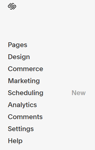
To make navigation bar scroll with page, also known as Sticky Navigation, Fixed Navigation, login to your site

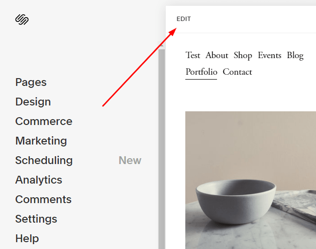
Hover on Right Side > Click Edit

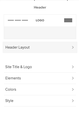
Hover on Header > Click Edit Site Header

Header Layout box will appear. Click Style

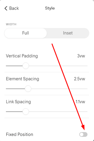
Enable Fixed Position

Done. Save
Shrinking navigation bar when scrolling down
Do above.
Then add this CSS to Home > Design > Custom CSS
.header-announcement-bar-wrapper.shrink {
    padding-top: 1px !important;
    padding-bottom: 1px !important;
}
Thanks for your tips. I’m using Nolan Co template and when I try to put your code about hidding menu in one page, that does not fuction. That hides from all pages instead of one. Thanks in advance
Which code did you use? Can you share site url? Also I sent you an email. You can reply there. Comments here don’t work properly.
These are great! I was trying to use the “Add button to navigation” code to add a background image instead of colour and it doesn’t work. Can you provide a solution to making a navigation item have a background image?
I sent you an email. You can check.
Hi! thank you sooo much for these! wondering if you’d be able to add how to fake a secondary nav? i miss that from 7.0. would love my site to read [link siteName link]. my missing piece is the navigation has such serious side padding or something so they keep overflowing underneath (since my site name is long). thanks! https://rust-vuvuzela-cepg.squarespace.com/ “salt” for reference
Sent to your email!
Hello,
I am having problems reducing extra space above and below on Squarespace (7.1) mobile gallery
Can you please help?
I would like to inject Ads by Google code above the primary navigation of the site. Right now when inject the code it is automatically placed under the navigation. Any idea on how I can fix to be above the top navigation?
Hi there,
I’d like to change the amount of space in between my navigation links, greater than the built in max of 5vw.
Hi. Sent to your email.
Hi
Is it possible to add a button so when my visitors are using site they can hide the site quickly of necessary? ( my company provides safety tips for people in possible danger this is why I need to enable this on my square space website.
I just sent answer to your email.
Ahh, finally a way to hide the hamburger. Thank you!
I wrote in the guide. You should check again. It is “CSS – Remove Mobile Navigation”
Hi there,
On our site, we’re looking to have a hamburger menu on the navigation on desktop and mobile. We’ve added some CSS to get the hamburger to appear on the desktop but it pulls the links from the main navigation it seems, so if we move things away from the main navigation – it then doesn’t appear in the hamburger menu.
Any code to help with this? We just want a hamburger menu, acting as the primary navigation, and the navigation links on the header effectively hidden?
Code currently used:
@media screen and (min-width: 1px) {
.header-layout-nav-right .header-nav-list {
display: none;
}
.header-burger {
display:flex;
}
.header–menu-open .header-menu {
opacity: 1;
visibility: visible;
}
.header-nav [href=”/new-page”] {
display: none;
}
.header-menu-nav [href=”/new-page”] {
display: none;
}
Sent to your email.
Hi Tuan Phan, I’m struggling to find a solution to hide a forced mobile menu on desktop to close when clicking outside the menu area. Version is 7.1. Let me know if you can help! Thank you 😉
Sent to your email.
On our website the burger menu shows up on desktop computers when the resolution is high or when zooming in. Is there some way to avoid this?
Hi. What is site url?